
Bewor Tech Clients Dashboard Design
Pilot panel to create customer requests.
My role
UX/UI Designer
Industry
Fintech
Platform
Figma
Bewor Tech is a company specialized in solutions for digital identity. One of its most promising products is CarteraDigital, a tool that allows companies to request documentation from their clients quickly and securely through a digital certificate in the cloud. In this way, it eliminates the delays associated with manual document collection, optimizing the process and saving valuable time.
For this project, my task was to design and develop a management panel that allowed companies to generate documentation requests intuitively, in addition to offering complete control over the status of each request. The main objective was to launch a functional MVP that facilitated product validation and its adoption in the market.

Process
Identify the pain points of potential clients
To create a product that truly grabs the attention of large companies, we first needed to understand their weaknesses when obtaining their clients' documentation. After researching, we came to three main conclusions:
Obsolete system: Their software had many failures and constantly stopped working.
Slow process: They take an average of 10-15 days to gather all the documentation from a client. We discovered that their clients take a long time to provide all the requested documentation, making the process long and tedious.
Physical documentation: Much of the documentation is stored in physical format. This takes up space and poses the risk of loss if not digitized.
Define the possible solution
Now that I have all the information from the interviews, I formulated some "How might we" questions to find a solution.
How could we improve the document procurement process for clients?
How could we prevent physical documentation from being stored in offices?
How could we improve the current system in offices?


Design
First Iterations
With the first version created, we decided to conduct tests with users to refine the final design further.
These were some of the main iterations:
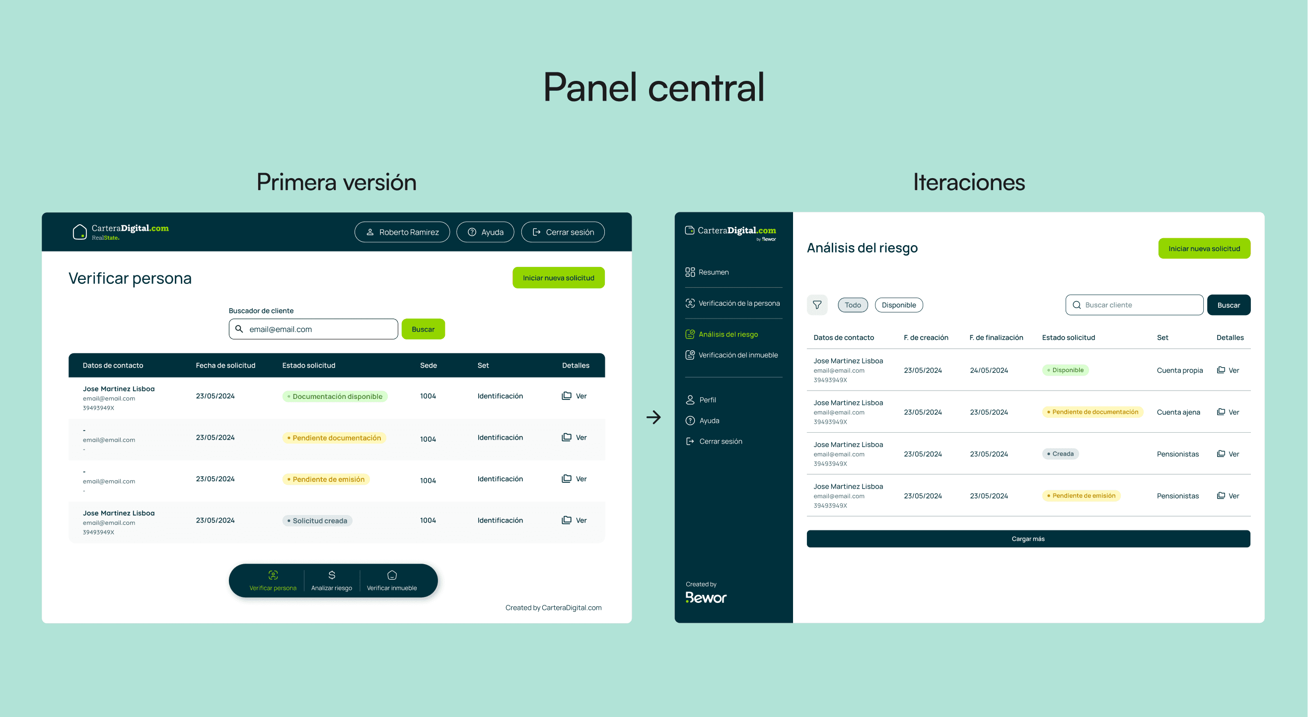
Navigation problem: In the first version, we chose to implement two distinct navigation systems. However, after conducting user tests, we found that this configuration was confusing and hindered the user experience. To address this, we redesigned the interface by adopting a more conventional navigation scheme, aligned with the standards of modern dashboards, which significantly improved usability.
Difficult to scan information: We quickly realized that if the client list grew too large, finding a specific client or group just by their name would be impossible. As a solution, we incorporated a basic filtering system that allows for more precise searches and improves client management.

Segmented into steps: Given the large number of documents that could be requested, we realized that the form could become excessively long, generating an infinite scroll that would affect the user experience. To solve this, we segmented the process into three phases and incorporated a visual indicator that shows at all times what stage the user is in, thus improving the clarity and usability of the flow.

Usability Improvement: For this screen, I felt it was too simplistic, even for being an MVP. Therefore, I gave it a makeover and restructured the presentation of the client data to make it clearer and easier to read, thus improving the user experience.

Results
Outcome and Expectations
With the MVP developed, we began to present the product to large companies, attracting the interest of renowned firms such as the Caja Rural group and Telefónica.
Currently, the product is in its early phases of launch, but the initial meetings have been very promising, which gives us high expectations for its growth and adoption in the market.