VideoID process for clients
Get your customers' information instantly through a videoid.
My role
UX/UI Designer
Industry
Tech
Platform
Mobile and Desktop
At Bewor Tech, we reached an agreement with Caja Rural to bring our product, CarteraDigital, to their offices. Along with the creation of a panel for them to manage their clients — we created a record so that users could generate their documentation for the bank.
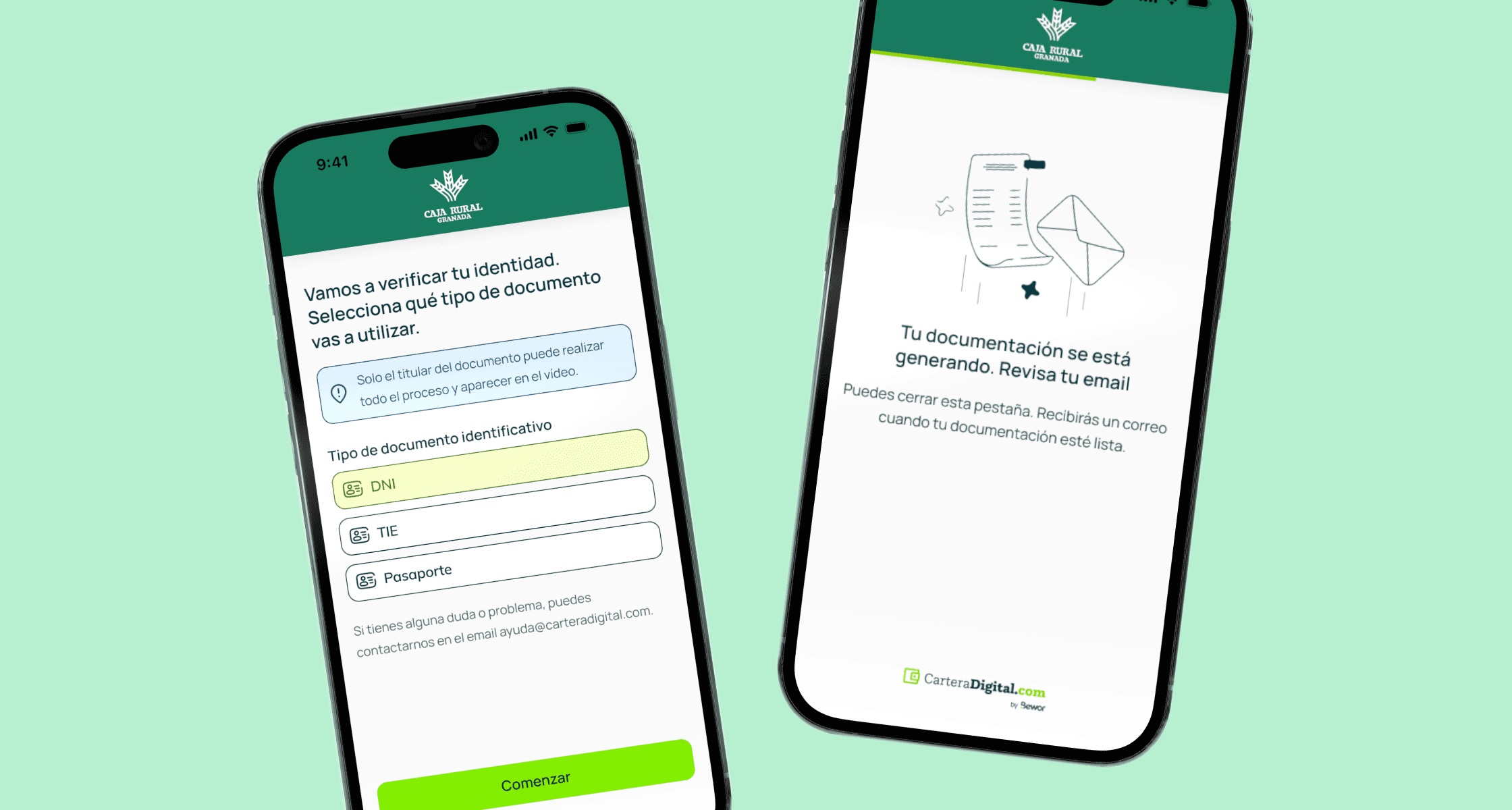
In this process, the goal was for the client to perform a video identification to create an electronic certificate to connect to the electronic headquarters and thus be able to generate all the documentation that the bank had requested from the client.
Process
Define the objectives
Now that we knew everything we needed from the user, we could outline what the objectives to define should be:
Ensure that all customers receive detailed information and easy to understand information about the required documents and the steps to follow to complete their procedures.
Implement a digital solution that allows customers to send documents and verify their identity online, eliminating the need for physical visits to the branch.
Simplify the forms and procedures necessary for document processing, making the process more intuitive and easy to follow for customers.
Keep customers informed about the status of their procedures through notifications and regular updates.

Design
Initial designs and iterations
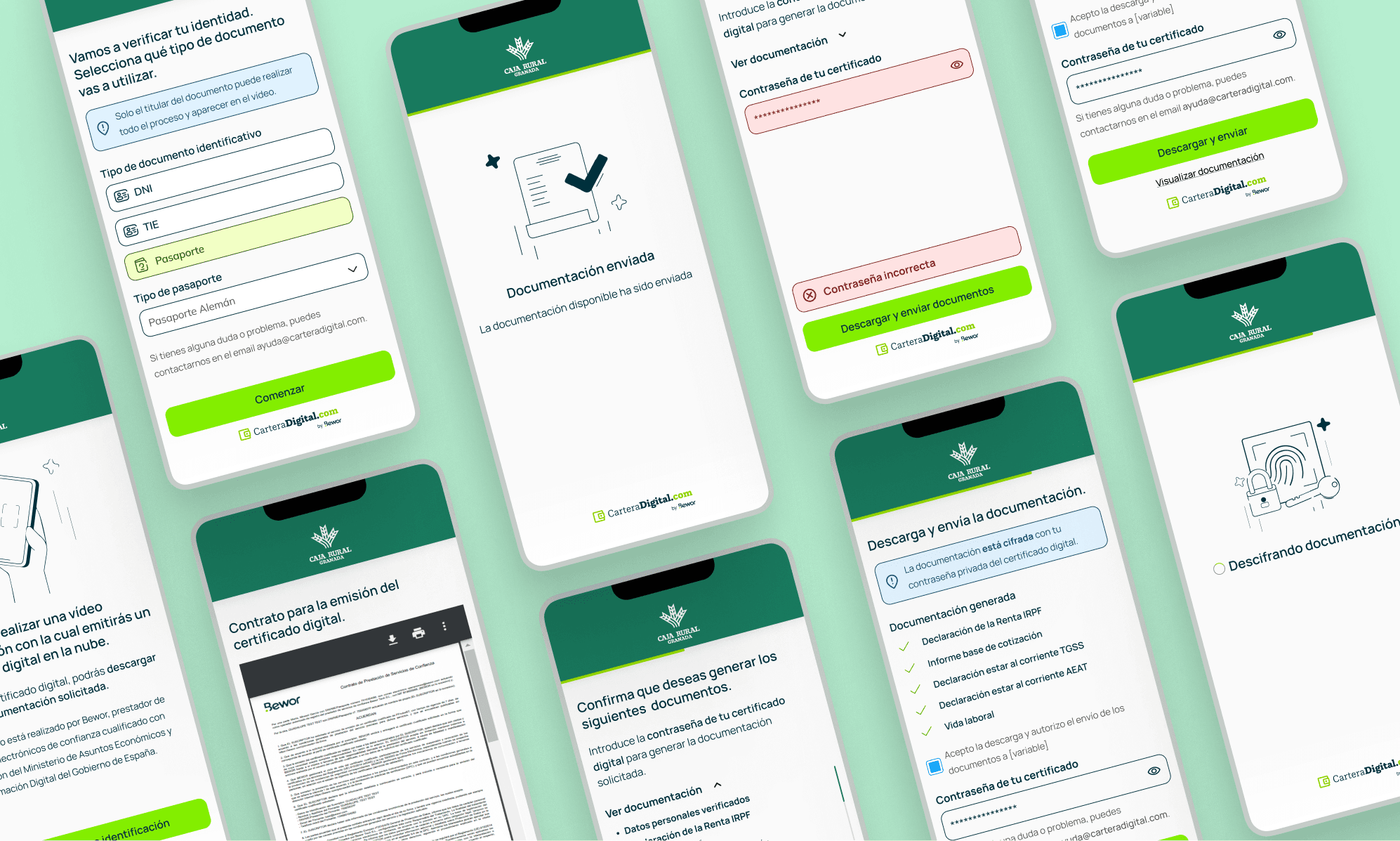
Once we had all the information we needed from the client, I created some initial versions of the design and we conducted several internal tests with the team and developers to improve:
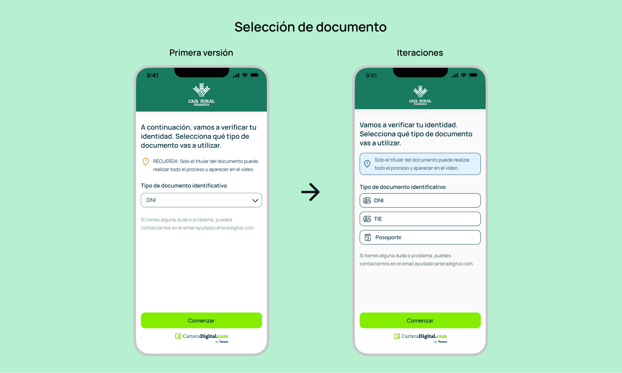
The caption goes unnoticed: Practically everyone agreed that the message reminding that only the client can make the video did not carry much weight considering how important it is. To fix that, I added a color to the background so that it stood out from the other elements on the screen. I was debating between orange and blue, but in the end, the orange gave the feeling of danger or error, so I opted for blue which is more related to a reminder.
Fewer clicks: Since only 3 possible documents are requested, it did not make sense to have a dropdown as that would add one more click to the process and slow it down, which is something we want to avoid in the established goals.

Enter the code: We all decided that the way to enter the code received in the first version was too simple, we decided to change it to a more modern style and also decided to add the phone number you used in case there is any issue when sending the SMS so the client knows which phone was entered.
Progress bar: To make it clearer for the user how much time was left to complete the process, I added a progress bar at the top to prevent users from abandoning the process due to not knowing how long it would take.
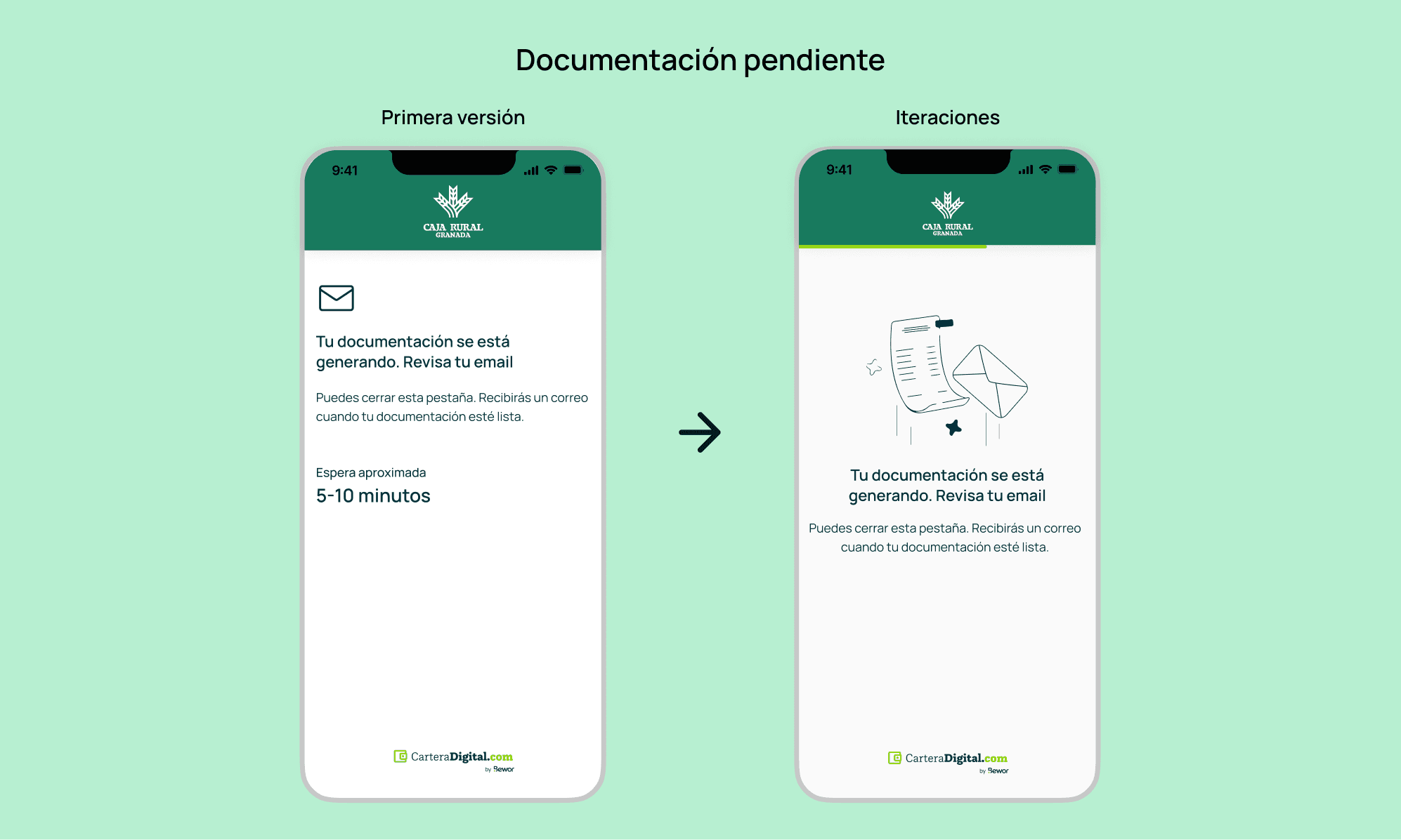
Changes in the overall UI: Many screens felt very simple, generic, and soulless. I decided to clean up the screens much more and use much more original images so that the user experience is much more unique and not a monotonous and boring process.

Results
After presenting the demo with Caja Rural they were delighted with the product and believe it can solve many of the problems they currently have. The idea will be to incorporate a trial in several offices to be able to test the product with end customers and see their reactions.
If the trial goes well, it will be implemented not only in Caja Rural Granada but also in all Caja Rurales in Spain, which would have a considerable impact.
I will update this post when I have more news as the implementation of this product can take quite some time in terms of logistics for a bank.